Turn your PostgreSQL queries into Charts
Earlier this year we did compare compare
Aggregating NBA data, PostgreSQL vs MongoDB then talked about
PostgreSQL, Aggregates and histograms where we even produced a nice
Histogram chart directly within the awesome
psql console. Today, let’s get
that same idea to the next level, with
pgcharts:
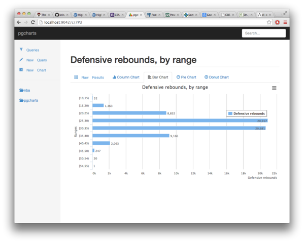
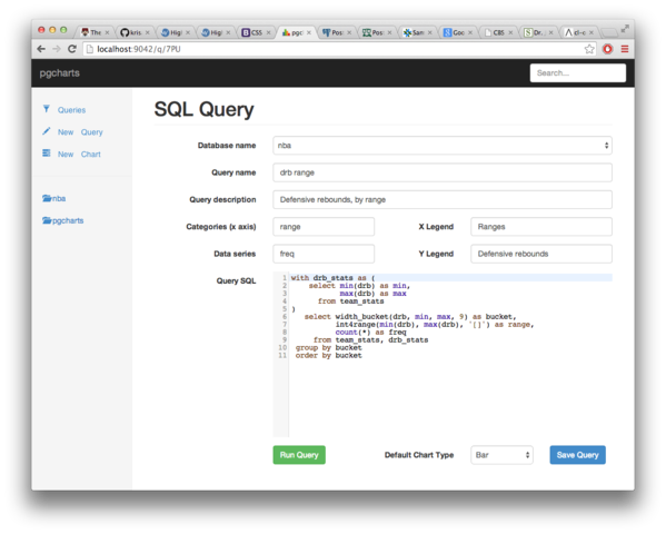
The application’s specifications are quite simple: edit an SQL query, set your categories and your data series, add in some legends, and get a nice chart. Currently supported are bar, column, pie and donut charts, and we should be able to add anything that http://www.highcharts.com/ has support for.
Currently, you need to compile the application yourself, and for that you need to install the SBCL compiler. Soon enough you will have a debian package to play with! The README at the pgcharts github place has the details to get you started. Enjoy!