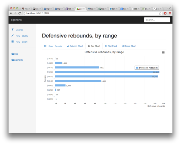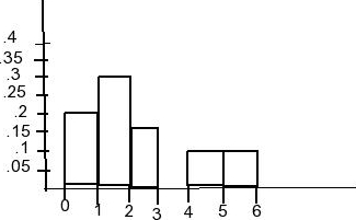
Earlier this year we did compare compare Aggregating NBA data, PostgreSQL vs MongoDB then talked about PostgreSQL, Aggregates and histograms where we even produced a nice Histogram chart directly within the awesome psql console. Today, let’s get that same idea to the next level, with pgcharts:
*The new [pgcharts](https://github.com/dimitri/pgcharts) application* The application’s specifications are quite simple: edit an SQL query, set your categories and your data series, add in some legends, and get a nice chart.

In our previous article Aggregating NBA data, PostgreSQL vs MongoDB we spent time comparing the pretty new MongoDB Aggregation Framework with the decades old SQL aggregates. Today, let’s showcase more of those SQL aggregates, producing a nice histogram right from our SQL console.

When reading the article Crunching 30 Years of NBA Data with MongoDB Aggregation I coulnd’t help but think that we’ve been enjoying aggregates in SQL for 3 or 4 decades already. When using PostgreSQL it’s even easy to actually add your own aggregates given the SQL command create aggregate.
