PGday.eu feedback
At pgday there was this form you could fill to give speakers some feedback about their talks. And that’s a really nice way as a speaker to know what to improve. And as Magnus was searching a nice looking chart facility in python and I spoke about matplotlib, it felt like having to publish something.
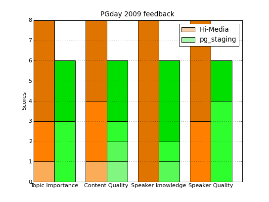
Here is my try at some nice graphics. Well I’ll let you decide how nice the result is:
If you want to see the little python script I used, here it is: feedback.py, with the data embedded and all…
Now, how to read it? Well, the darker the color the better the score. For
example I had
5 people score me
5 for
Topic Importance on the Hi-Media talk
(in french) and only
3 people at this same score and topic for
pg_staging
talk. The scores are from
1 to
5,
5 being the best.
The comitee accepted interesting enough topics and it seems I managed to
deliver acceptable content from there. Not very good content, because
reading the comments I missed some nice birds-eye pictures to help the
audience get into the subject. As I’m unable to draw (with or without a
mouse) I plan to fix this in latter talks by using
ditaa, the
DIagrams
Through Ascii Art tool. I already used it and together with
Emacs
picture-mode it’s very nice.
Oh yes the baseline of this post is that there will be later talks. I seem to be liking those and the audience feedback this time is saying that it’s not too bad for them. See you soon :)
Update
I have added the
feedback.py script now that each page here is published
separately.
#! /usr/bin/env python
#
# http://matplotlib.sourceforge.net/examples/pylab_examples/bar_stacked.html

from pylab import *
import numpy as np

clf()
subplot(111)

N = 4

# http://html-color-codes.info/ for inspiration
scoreColors   = (('#F5D0A9', '#F7BE81',
                  '#FAAC58', '#FF8000', '#DF7401'),
                 ('#A9F5A9', '#81F781',
                  '#58FA58', '#2EFE2E', '#01DF01'))

# data from the mail
expHMScores   = ((0, 0, 1, 2, 5),
                 (0, 0, 1, 3, 4),
                 (0, 0, 0, 0, 8),
                 (0, 0, 0, 3, 5))

stagingScores = ((0, 0, 0, 3, 3),
                 (0, 1, 1, 1, 3),
                 (0, 0, 1, 1, 4),
                 (0, 0, 0, 4, 2))

ind = np.arange(N)    # the x locations for the groups
width = 0.4       # the width of the bars: can also be len(x) sequence

hd = array([expHMScores[x][0] for x in range(0, 4)])
hp = bar(ind, hd, width, color = scoreColors[0][0])

sd = array([stagingScores[x][0] for x in range(0, 4)])
sp = bar(ind+width, sd, width, color = scoreColors[1][0])

for s in range(1, 5):
    d = array([expHMScores[x][s] for x in range(0, 4)])
    bar(ind, d, width,
        color = scoreColors[0][s], bottom = hd)
    hd += d

    d = array([stagingScores[x][s] for x in range(0, 4)])
    bar(ind+width, d, width,
        color = scoreColors[1][s], bottom = sd)
    sd += d

ylabel('Scores')
title('PGday 2009 feedback')
xticks(ind+width,
       ('Topic Importance',
        'Content Quality',
        'Speaker knowledge',
        'Speaker Quality') )

legend([hp[0], sp[0]], ["Hi-Media", "pg_staging"])

grid(True)
savefig('feedback.png', dpi=75, orientation='portrait')

